TLDR version of this post:
- New mentor page mock-up is here. (Quick and dirty — hasn’t been to design yet.)
- Draft copy for the page is here.
- List of supporting links for the page.
More context, rationale and design brief below.
Creating webmaker.org/mentors
I’ve been working with the Webmaker Mentor team to create a new page for mentors on webmaker.org. The goal: turn our offerings for mentors into something…
- a) easy to find and understand,
- b) highlighting the key calls to action, in a way that
- c) feels like a cohesive whole, instead of disconnected bits and pieces.
This posts summarizes our work and thinking to date. Building from the context provided by:
- Chris’s post on mentor plans for 2013
- The new mentor community road map
- Laura and Michelle’s work on feedback from mentors
“Mentor funnel” and “mentor flow”
This quarter we’re going to focus on two key pieces:
- a) the mentor funnel. How do mentors find us? What paths and on-ramps do they take?
- b) mentor flow. What happens once they get there? What are the steps in the process for teaching or mentoring your first time? What’s the psychology and user experience like? How do we make it all easier?
Mentor flow: What are our main calls to action?
Let’s start with the mentor flow piece. What are some core actions and ways for mentors to get involved?
- Join. Join our global mentor community. With easy ways to get started, stay in touch, and contribute back.
- Teach. Access and share free tools, kits and learning resources. Get started in five minutes or less. Make, teach and learn as you go.
- Connect. Connect with other mentors near you, and around the world. Share ideas, compare notes and see what others are doing.
- Network. Lots of smart organizations are already doing this work in your community. Bring together code clubs, hacker spaces, libraries, etc. in your hometown, with help from the Hive network.
- Get help. Easy ways to access support, find answers to questions when you’re stuck, and go further.
Which of those are the most important?
Answer: JOIN. Our latest thinking is that most important of these calls to action is “join,” and that the page should reflect that as the #1 design goal. If users do ONE thing once they hit the page, that’s probably the most important. Why?
- It makes all the other steps easier. Once you’ve joined (by creating a quick and easy account on Webmaker.org, and self-identifying as a mentor), it’ll become easier to:
- connect with other mentors near you,
- save the projects you create using Webmaker tools, and
- share your profile, stories and resources.
- It’s our lifeline for staying in touch. Turning casual mentors into repeat mentors, and hopefully moving up a ladder of engagement over time.
- It’s key for us to track our growth and measure how we’re doing. We want to 10x our mentor community this year. But right now, we have no clear way to measure that.
Design challenge: make sure the value of “join” is clear and compelling for mentors. No one likes meaningless sign-ups or “creating accounts.” So “join” needs to feel good and provide real value. (The killer feature, in my view, is the ability to save your work. Using Popcorn Maker and Thimble is way more awesome with an account, and Persona makes it genuinely painless.)
Ok then. So what might the page design look like, then?
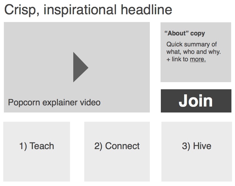
Maybe a wireframe like this:
- Tier 1: Crisply explain what it our mentor offering is in an inspirational way. Driving into the main call to action.
- Tier 2: The secondary calls to action. With additional on-ramps and pathways.
Using Popcorn to help tell the story
Explaining what’s on offer in a crisp way is a primary goal. This stuff isn’t necessarily obvious or crystal clear for people encountering it for the first time, and both “webmaking” and “mentors” are unfamiliar terms for many. So let’s…
- Capture it in a single headline. It should be inspirational and telegraph our non-profit, “let’s change the world together” ethos.
- Use a simple 30-second Popcorn video to explain. Doesn’t have to be fancy — just audio with pages and links over top. That way we can pull in the actual tools and resources, in addition to just talking about them.
- Summarize the story in three sentences. Focused on what, who and why.
A global community of friendly humans on a mission
One of the key pieces of feedback from our mentor feedback is that we need to signal our ethos. That this isn’t just about software or teaching people to code — we have a shared mission, and we want to work together as part of a big tent for teaching the world the web.
The other key piece of information that needs to come across is the fact that this community is real — it’s not just an idea; we have real people doing real, inspiring stuff around the world. We need to signal that with our imagery and message.
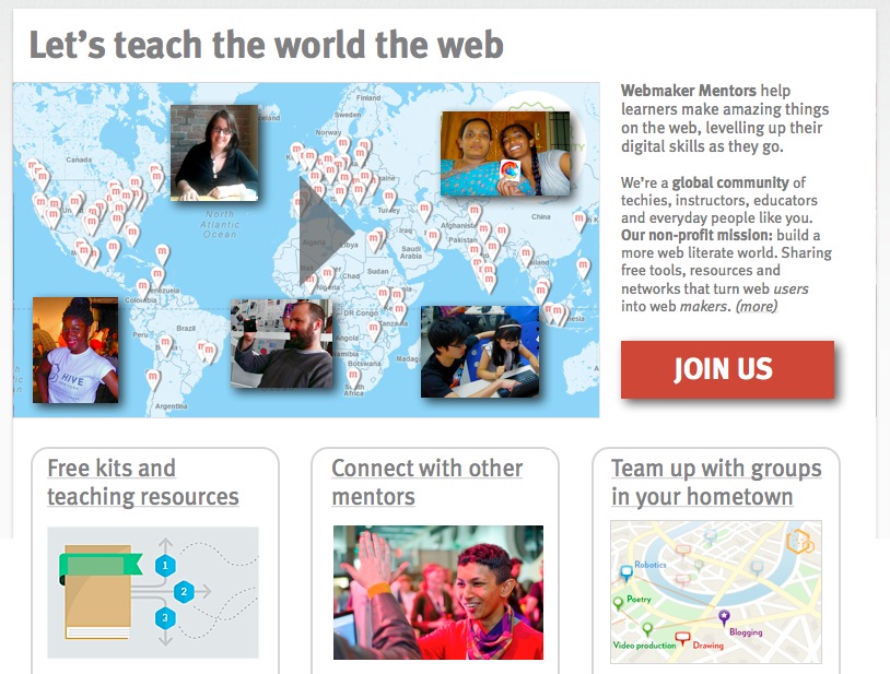
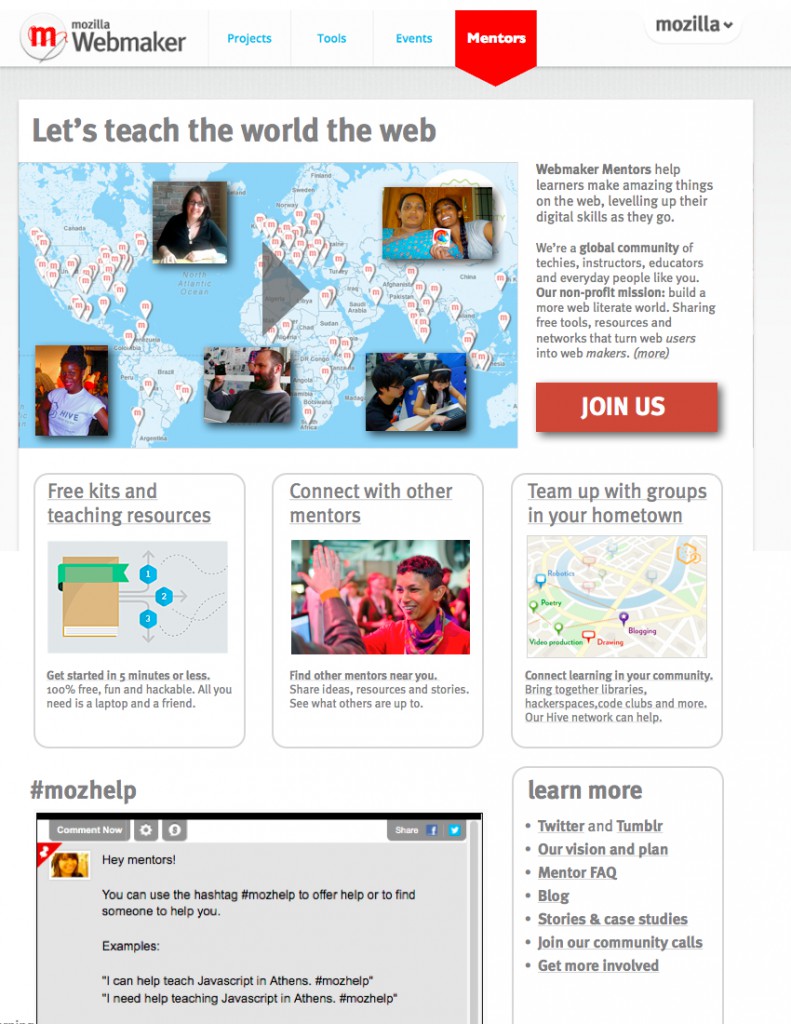
I’m not a designer. But here’s a quick and dirty mock-up that tries to pull that into practice:
- “Let’s teach the world the web.” If mentors gathered under a banner in a crowd, what would that banner say? What words would they paint on a t-shirt? Why do they care about this?
- Supporting calls to action help spell out the value proposition. The three supporting calls to action try to unpack or explain the value of “join us” — while also linking straight through to those pages.
- Human, global, real. The video poster image says we’re a) a community of friendly humans that’s b) genuinely global and c) real.
- Bringing together groups and orgs in your hometown. From our user’s point of view, it’s about something you do with other organizations, not just by yourself. In a way that speaks to hometown civic pride.
- Supporting links and content go below. Primarily: the #mozhelp Scribble Live feed, to get dynamic, mentor-generated content on the page. Plus supporting links for pages to support, FAQ, etc.
The copy and design are rough
But what do you think about the general strategy, calls to action and copy? And how do we ensure the value of joining is clear and compelling?
- Provide feedback on the Webmaker newsgroup
- Draft text and copy for the page is here
- Add supporting links for the page. What’s missing that needs to be there?


One comment