Yesterday I wrote about how we’re working on updating the Webmaker story. Brett Gaylor’s “finding our audience” post does a terrific job of outlining who that story is for — as does Mark Surman’s post on “Who wants to teach the web?”
These posts are important for understanding the kind of people we most want to reach right now: people who are passionate about teaching and learning. They love the web, and want to share their passion.
People who teach others about the web are key to the future of Webmaker — and maybe even the future of Mozilla. —Mark Surman
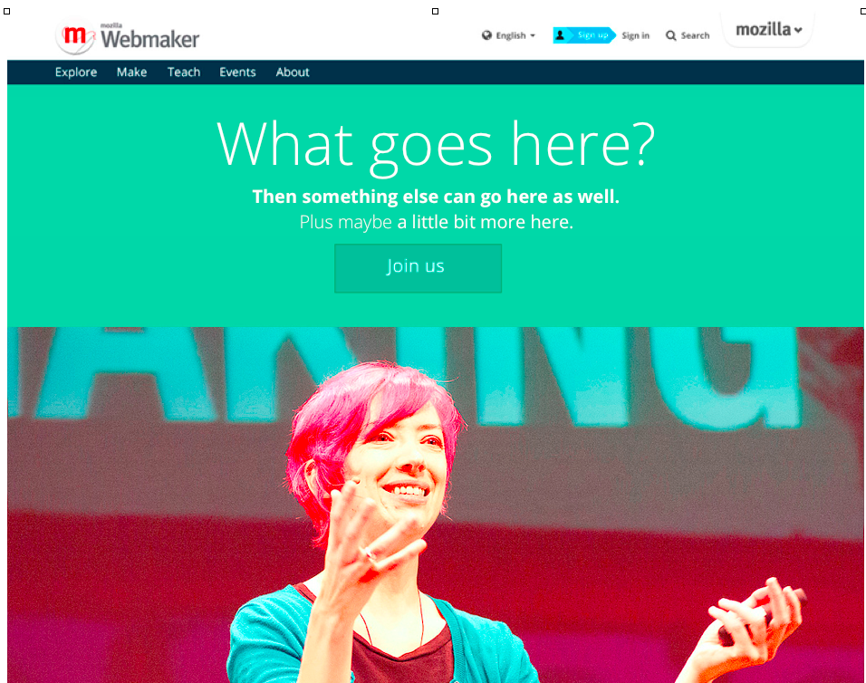
Translating our message into front page copy
Now comes the hard — and fun — part: how would you translate that overall story into a crisp headline and nutshell on Webmaker.org’s homepage? Thinking metaphorically about it…
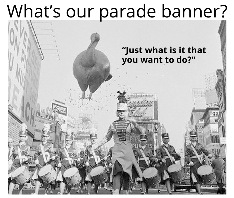
- What’s the banner our community would carry at a parade?
- What’s the flag or umbrella our tribe is gathering under?
- What’s our secret mission? How do we make the world better? Where are we sailing this funky pirate ship?
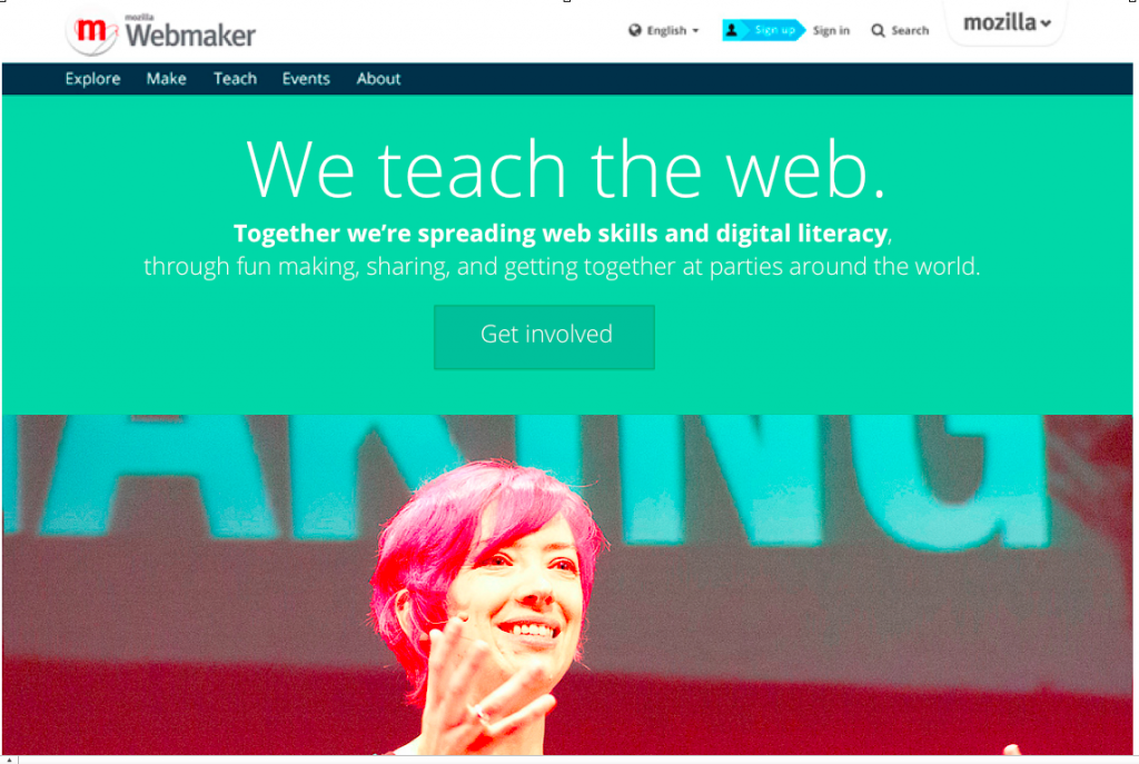
We teach the web.
At its simplest level, I think that’s what we do. That’s the tagline I’d propose testing next. Does it capture everything? Does it tell the complete story? No. But taglines don’t have to — they’re just meant to start. And it feels like the right peg to hang our larger story on.
“We teach the web” plants a flag in two key areas: teaching and the web. And the “we” signals that we’re a community — a group of people doing this together.
So maybe the main front page would read something like…
We teach the web. Together we’re spreading web skills and digital literacy — through fun making, sharing, and getting together at parties around the world.
Get involved.
Does that message work for learners, too?
What about the people who aren’t just teaching — what about learners / “end users” / “makers?” The people our target audiences of mentors and teachers want to serve?
To me that’s an added advantage of this message: it works as a value proposition for learners, too. It says: “We’re a community of people who want to teach you web skills.” That’s what we’re here for.
Alternate options and ideas
There are lots of different ways we could tweak this basic message. We’ve listed a dozen alternate options in the pad. Please add, remix or brainstorm around alternate ideas — there are no wrong answers. What message would you put on Webmaker’s welcome mat?
What’s key?
- Let’s err on the side of clarity. What is our community already succeeding at? Let’s capture the value simply. And eliminate confusion about what the site is for.
Users had an immediate positive affiliation with the design and interface, but they were not always clear on the purpose of the site. —Brett, summarizing user survey results
- Signal fun. Inspiration, whimsy, play — those are defining parts of the brand. It’d be great to inject a little more playful spirit into the copy. A friendly punch in the shoulder. Copy that surprises or makes people smile.
- Showcase our face-to-face events. It’s become a key part of the Webmaker experience and product. We reached 50,000 people through these events over the past three months! It’s an amazing part of the product — and a key use case for the web site.
- Localization is key. We’re offering Webmaker in multiple languages and locales, thanks to a growing community of localizers. So words like “awesome” or “radsters” or “edu-geeks” may not translate well.
- Let’s ship a new iteration, then test and refine. We can update for the Mozilla Festival, then refine based on what we learn there. We’ve already done some preliminary focus group testing. Let’s ship something updated for MozFest then update it based on what we learn.
What’s next?
Let’s test and tweak together. To give ourselves enough time for localization, content freeze is Oct 9.
- Suggest other ideas. Alternative options and new ideas are gathered here.
- Follow this work. The ticket for the overall front page design is here.


Great post, except for one thing. “What’s our secret mission?” Seriously? If we tell everyone, then IT’S NOT A SECRET ANYMORE. I can’t believe I have to explain this.
😉
Just kidding, everyone knows our secret mission is to empower everyone everywhere. Shopping is hard, let’s teach the web.
Shhhhh! Don’t tell anyone about our secret wide open source mission to freely empower people with skills. 🙂
“Shopping is hard, let’s teach the web.” That actually has some of the whimsy I was talking about…
The perfect copy should include some of that. Something that shows we don’t take ourselves too seriously.
Brett, Kate Hudson and Erika D are good at that style of writing — got any ideas?
Or maybe Matej?