 1) Usability testing can be fast, easy, and the most powerful thing you do all year
Regular user testing should be Webmaker’s secret weapon this year. It doesn’t have to be rigorously scientific. It doesn’t have to be hard. You don’t need any special training to do it. All you need is to take someone — anyone, really — and put them in front of a Webmaker.org page or tool, and begin with something obvious like:
“So, what do you think this is about?”
Then just ask them what they feel like doing next, and observe. You will immediately start learning at an incredibly accelerated rate. It’s like an epiphany. The sky opens. You start seeing things as they really are.
If we’re not doing regular user testing, we’re not doing the real work. We’re just trading opinions in the dark.
2) People generally like Webmaker and get what it’s about.
We’ve made progress since our last big round of user testing. That testing revealed that people were having a hard time understanding what the Webmaker.org site was for. We didn’t see that much this time; people are getting it. Now we’re uncovering the next key challenge:
We need to make it easier to get started.
That’s where we saw the biggest gaps and roadblocks for users. More specifics below — but that’s a good frame for the UX challenge we should be focused on this quarter: make it easier to get started. 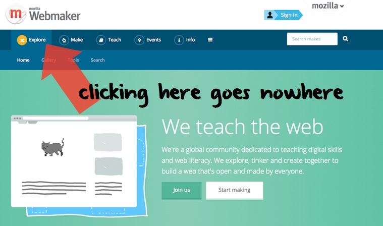
3) Our main nav needs one obvious quick fix
There’s a simple fix we can make to our main navigation right away: when you’re on the home page, clicking the “Explore” button doesn’t really do anything. It’s the most-clicked item in main nav — and it doesn’t take users anywhere. We can fix that.
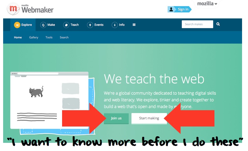
4) The two main front page calls to action need some refining
Suggested: “Explore.” The first thing on the ladder is: “tell me a little more.” Or: “let me poke around a little.” I’d like to do further testing on what users actually want from “Explore” — I think it’s the right word, but we need to test around what users really want and expect from this.
“I’d want to read or learn more. I feel like these two buttons require me to dive in, but I want to know more first.” –Cody
it’s a bit like: they wander into the party, and we’re like: do you want to 1) dive into the pool, or 2) whack this pinata? Visitors kind of want to take their coat off, see who else is there, and mingle a little.
5) People scroll right past the front page community photos
Nuff said.
6) They don’t love the “start making” section…
“These things all feel kind of specific. And I’m not sure I want to make a movie poster or a book cover or whatever.”

7) …but the “call to action” section is useful and tells the story well
Users get this. This is actually a pretty clear distillation of what we do. They actually found this more useful than the ‘start making’ section. We should consider up-leveling this “Teach, Make & Learn, Get Together” story. It’s a good explanation of what Webmaker.org does.
“This ‘call to action’ section gives me more of a high-level idea of what I can do here. The ‘start making’ section is pretty specific — and I’m not sure I want to do any of those things.” –Cody

8) The starter makes make it hard to get started
um… I’m not sure how to get started here?
This is killing people! And is easily fixed. When you click on an activity from certain pages, it should open the remix screen automatically — or at least make it a lot clearer how to get started. It’s not at all clear to people that they should click the green remix button in the top right.
9) Our code comments should be designed for quick scanning, not reading
We’re working on replacing code comments with the new tutorial fucntion in Thimble. But it’s helpful to observe what people want prompts and help with in Thimble. They are *scanning* through the code on the left — usually because they’re looking for a particular element they want to change on the right. The code comments need to easily flag where the elements start and end, to make that visual scanning easier.
“I like how [the code comments] are breaking it into tasks. I’m just finding it difficult to find the task I want.” –Anonymous
People don’t start in a linear, “first you do this, then you do that way.” They jump around. We need to write and design for that.
10) The X-Ray Goggles page makes it hard to get started
‘re way too long! We’ve known this for a while, but watching someone actually use them helps understand what the use and style guide for code comments or tutorials should be.
It’s easy to frame usability testing as being all about “tough love.” As in: show us all the ways our project is broken or still needs an enormous amount of work.
It isn’t. Usabilty testing is inspiring. It helps you understand and relate to your audience as three-dimensional human beings. Part of that reveals the places they get stuck or are confused. But it also highlights the parts they like. The people I user-tested with surprised me with how willing they were to take on relatively complex challenges with the X-Ray Goggles and Thimble. They were into it. Even the bits that were hard.